
In this Amazon QuickSight introduction, I will show you how to build a dashboard and make basic data visualizations. Amazon QuickSight is a cloud-based data visualization tool provided as a service with pay-per-session pricing.
-QuickSight can be connected to multiple data sources like:
o Amazon S3
o Amazon Aurora
o Amazon Redshift
o Amazon Athena
o Amazon RDS
-We can Upload Excel spreadsheets or flat files (JSON,CSV, TSV, CLF, and ELF)
-We can Connect to on-premises databases like Teradata, SQL Server, MySQL, and PostgreSQL
-We can Import data from SaaS applications like Salesforce and Snowflake
-We can Use big data processing engines like Spark and Presto
Here is the process to create a dashboard in QuickSight:
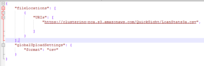
1) Fetching Data from S3 Bucket: I have stored my dataset(Loan Status) in S3 bucket: We use JSON manifest files to fetch csv/tsv/json files stored in S3 to import into Amazon QuickSight.
-There are different kind of formats available for JSON manifest files which we can use to fetch our files from S3 to QuickSight. After creating these json manifest files by providing location of our files in S3 and its format type, we upload these files either in local directory or in S3 bucket.
-If we uploaded manifest file in local directory, we must use upload option when we will be creating dataset using S3 in QuickSight. If we uploaded manifest file in S3 bucket itself, we must use URL option when we will be creating dataset using S3 in QuickSight.
-One Manifest file can fetch multiple files but those should be of same type of format. Exp: Manifest1.json can have 3 CSV files stored in S3 and Manifest2.json can have 4 JSON files stored in S3 even if these 7 files stored in the same bucket.
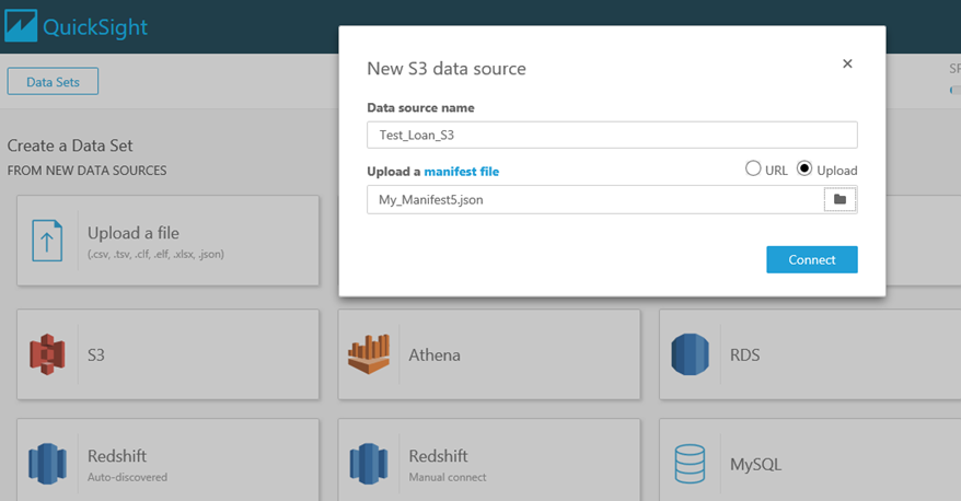
2) Create A Dataset in QuickSight Spice Engine for Analytics:
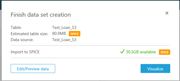
-Go to Manage Data and click New dataset. It will take us to the new page where we have option to create a Data Source Name in Spice Engine and upload our Manifest file. By clicking on Connect, we can see that our dataset(csv/tsv/xls/json) stored in S3 automatically imported into Spice Engine.
-It will take us to this page where we have option to Edit/Preview data for data preparation or directly we can go for visualization.
-By Clicking at Edit/Preview data, we are able to prepare our dataset in Spice Engine where we can add some calculated fields, rename columns/features and change the datatypes of our columns.
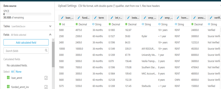
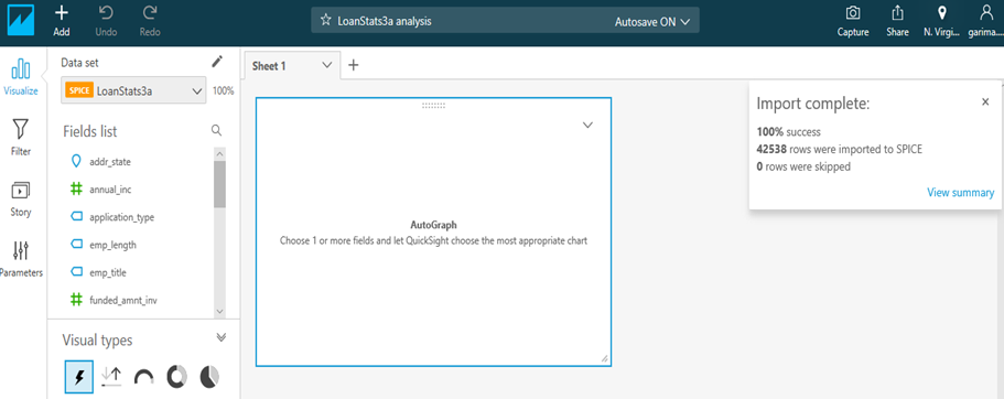
-After data preparation, Save and Visualize our data. From here, it will take us to the visualization page where we can create some charts and dashboards by analyzing and visualizing. We can see all the columns of our dataset in Fields list panel and by analyzing this data we would be able to create any kind of relevant chart using given visual types.
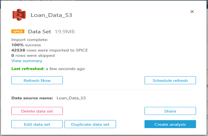
-We can see here total 42538 rows are imported to Spice and ready to be analyzed. We can see here there is automatically a visual added in the sheet1 where we can create any chart or graph using Visual types.
3) Create A Dashboard using kpi, charts, map, metric board and graphs: A Dashboard is nothing but a collection of charts and graph in a single screen for visualizing and communicating important business data to stakeholders and employees within the organization. These Dashboards are mainly used to visually tracks, analyzes and displays key performance indicators (KPI), metrics and key data points to monitor the health of a business, department or specific process. They are customizable to meet the specific needs of a department and company.
These are the methods used to create an individual chart and graph.
o Adding Visual.
o Selection of Visual.
o Adding a Calculated Field.
o Creating a Filter.
o Adding a Parameter.
o Adding a Control to the Parameter.
o Applying Filter to the Control.
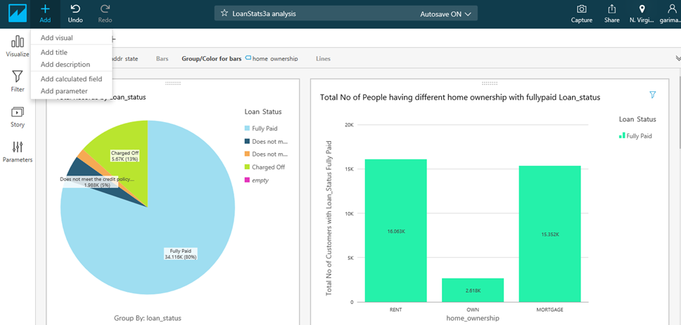
In the first Visualization you can see that, I have created Pie-Chart and Vertical Bar-Graph using Loan Status Dataset where Pie-Chart shows that 80% of People have Fully Paid Loan Status while Bar-Graph shows that People who are renting the property are better in Paying their Loans than people who are owing their house or having Mortgage.
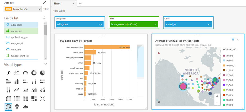
In the second Visualization you can see that, I have created Horizontal Bar-Graph and Geo Map where Bar-Graph shows that how much loan amount has been taken for different purposes and we can clearly conclude here Highest Loan amount has been taken for Debt Consolidation purpose.
Whereas the Geo Map shows that States in map with Annual Income and Total no of people who are renting their property and having the given annual income. By looking at the map we can conclude that in New York total 69 people renting the property having annual income 70,000 applied for the loan whereas total 115 people applied for the loan having annual income 60,000.
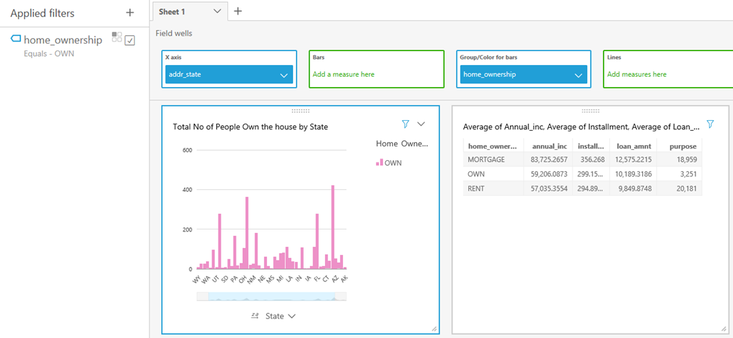
In the Third Visualization you can see that, I have created Vertical Bar-Graph and Metric Board where Vertical Bar-Graph shows that Total No of People applied for loan owing house per State and we can clearly conclude that, 421 people own the house California whereas 361 people own the house in NY.
Metric Board shows the Metrics of Annual Income, Total Loan Amount, Purpose of the Loan, Installment for people who Mortgage/Own/Rent their houses.
QuickSight provides some extra features to make the charts and graphs more interactive and informative:
o Create Multiple Screen.
o Make Some Charts immune from the Filter.
o Traversing from one screen to other using drill down.
o Format each individual Visual.
o Changing the Color of Chart.
4) Schedule Refresh Dashboard: To refresh your dashboard according to new data every Hour/Day/Week/Month go to the Manage Data then click on Your Data Set(Data Source Name given by you while importing the data from S3 bucket) stored in Spice engine and apply Refresh Now or Schedule Refresh in your Dashboard to manually and automatically update your Dashboard according to new dataset.
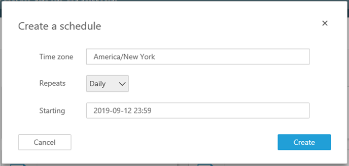
By Clicking on Schedule Refresh, it will take you to this Page where you can select the Repeats Hourly/Daily/Weekly/Monthly and select the starting time. In Standard Edition of QuickSight you can’t refresh your dashboard on hourly basis instead you need to have Business Edition to get this facility.
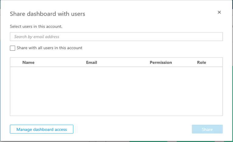
You can share your Dashboard with multiple Users in your account and you can manage Access to this dashboard as wel
6) Summary: Using Amazon QuickSight, you can see patterns across a time-series data by building visualizations, performing ad hoc analysis, and quickly generating insights. Surely will be posting other blogs in coming weeks which would be more detailed in terms of using all the features of QuickSight.